Key terms
Let’s start with a quick vocabulary lesson.
| Term | What it means |
|---|---|
|
Report |
Data Explorer’s bread and butter. A collection of data that is organized and presented in a meaningful way. Reports can be simple, showing only one piece of information, or very complex. A report contains the answer to a single query (or question). The complexity of the question determines the complexity of the report. Data Explorer comes with a variety of pre-built reports, or you can create your own. |
|
Dashboard |
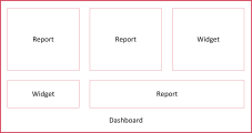
A collection of reports, widgets, and panels. When you first log in to Workforce Optimization, your home screen is a dashboard. Reports live on dashboards. A dashboard can contain many reports or only one. Data Explorer comes with a variety of pre-built dashboards that contain (you guessed it) pre-built reports. You can use these, tweak them to suit your needs, or build your own dashboards. |
|
Widget |
A widget is a bit like a report: it lives on a dashboard and contains information. Unlike a report, however, widgets are self-contained apps that have their own settings and filters. Data Explorer comes with a variety of pre-built widgets. You cannot create your own widgets. |
|
Panel |
A container for reports, widgets, or other content on a dashboard. To put a report on a dashboard, you first add a panel to the dashboard and then select the report to put in the panel. Each widget has its own panel. A panel can also contain a picture, text, or a website. |
This diagram illustrates how reports and widgets can work together on a dashboard.
